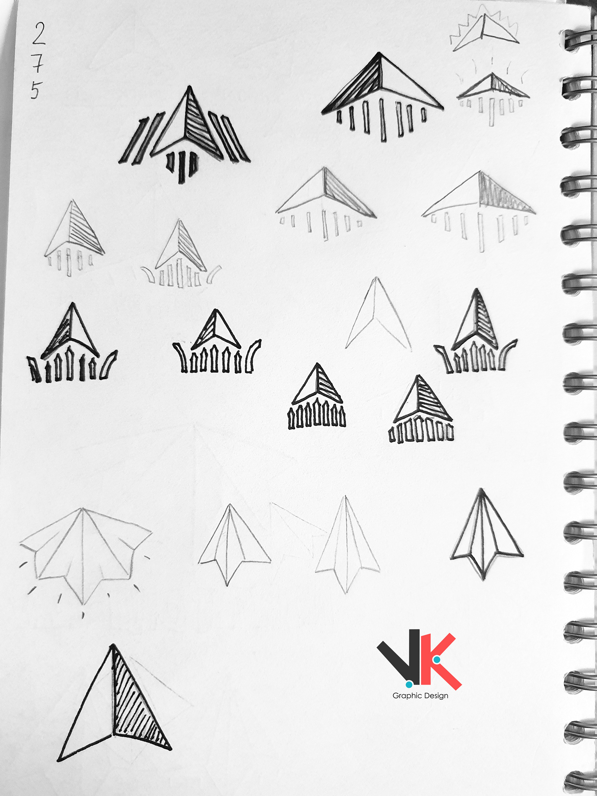
This logo was created for the Regional North Division management, which covers two different hotel branches and their seven restaurants in various parts of Great Britain, including Northern England, Scotland, Wales, Ireland, and Northern Ireland.
The main symbol was inspired by a typical visualization of the North, using numbers to represent the different branches.
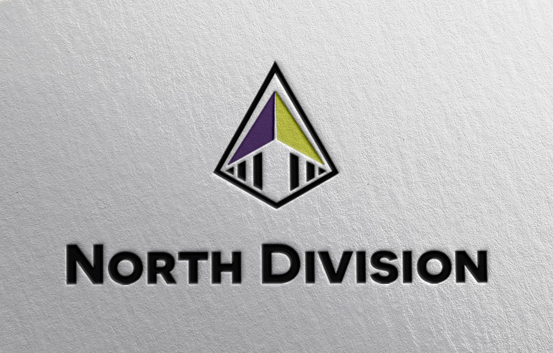
The colors were chosen based on the visual identities of the two main hotel branches.
The colors were chosen based on the visual identities of the two main hotel branches.
Below the symbol, seven pillars represent the seven sister restaurants, placed together to symbolize a building in perspective.
Overall, the logo represents the desired location and serves as an effective visual representation of the Regional North Division.
#VKGD